Visualizing Complexity
Scan through examples from our storyboards, workshops, and pilots that use drawing, mapping, and graphics to promote conceptual understanding and effective communication.
Faculty director Sue J. Goldie discusses disciplinary collaboration in the video above and how the Media Hub and its faculty use tools and visuals to improve multidisciplinary discourse.

Faculty director Sue J. Goldie and her course “Foundations for Public Health” was featured in the Harvard Gazette in September, 2020. The article highlighted Goldie’s approach to teaching during the forefront of the COVID pandemic. Related news: Sue J. Goldie Featured in Harvard Gazette
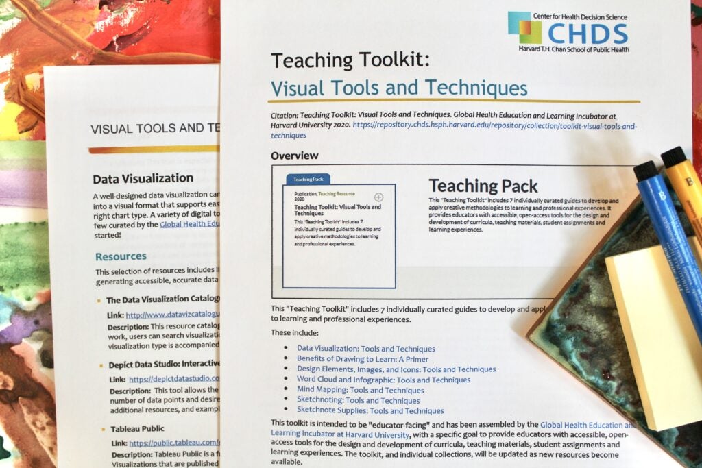
This toolkit includes guides to develop and apply creative methodologies to learning and professional experiences. It provides educators with accessible, open-access tools for the design and development of curricula, teaching materials, student assignments and learning experiences. Access collection: Visual Tools and Techniques
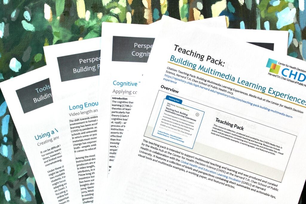
This collection is intended to support multimodal teaching and learning. Resources include briefs and perspectives containing short summaries and actionable tips, visual tools and multimedia examples, a working paper, and featured articles. Access collection: Building Multimedia Learning Experiences